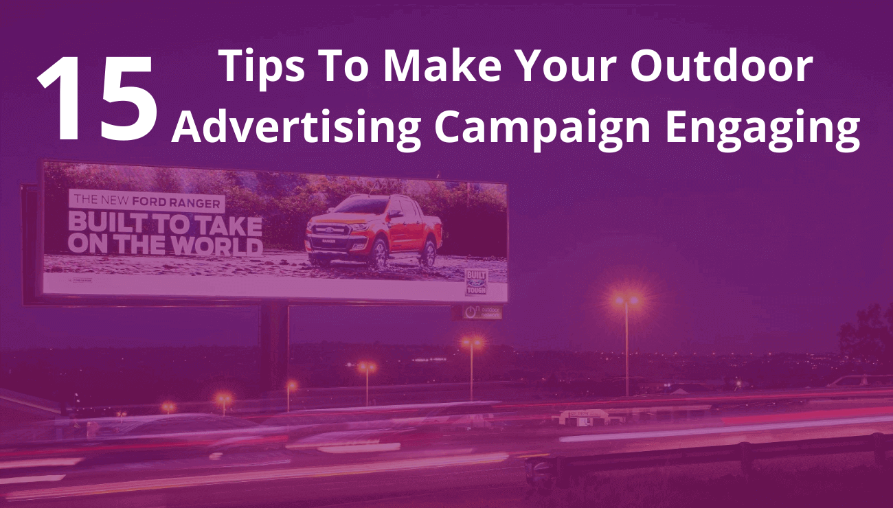
15 Tips To Make Your Outdoor Advertising Campaign Engaging

Outdoor advertising is a powerful medium to help unlock the growth potential of your brand. A creatively-driven, strategic campaign of sharable content is certainly the aim of an effective outdoor advertising campaign. So, while choosing the perfect location for your outdoor campaign, you need to ensure that your message stands out.
If you’re going to invest in an advertisement potentially seen by millions, you want it to do its job. Here are a handful of billboard design tips that’ll ensure your billboard is effective and eye-catching.
1. Get noticed, but don’t be a huge distraction
Most of the time, billboards are aimed at drivers, bikers, cyclists, or pedestrians. This causes an interesting dilemma for the advertiser. You want to get noticed, but you don’t want to be responsible for major, or even minor, accidents. So, while being distracting is paramount in many media, it’s a fine balance with the billboard.
2. Make them stand out from their surroundings
This can be done by using bright colors on your ad or consider adding spotlights or making the billboard glow-in-the-dark.
3. Make your advertising shareable
Think outside of the box to make your advertisement stand out from the competition. This is a great way to increase your reach as your advertisement will generate its own advertising, organically. For this consider bold marketing, creative digital, or experiential advertisements to make an effective impact on consumers.
4. Do the arm’s length test
Here’s a quick test to ensure you are not wasting everyone’s time and money. Print out your billboard to the size of a business card. Now, hold it out at arm’s length. Are you still getting everything you were when it was displayed on your 27-inch monitor? If not, go in and refine it. This needs to pop. And remember, you have roughly 10 seconds to get your message across.
5. Keep it simple
Effective outdoor advertising serves to give information quickly. So, send a message that can be absorbed in just a second or two. Keep the text as limited as possible around six words is best. If the image is giving the reader information, try not to duplicate it with your text. To reach the highest number of viewers (and potential customers), keep your billboard design simple. After all, some people may be blown by your billboard at 70 mph. Use big, bold fonts against contrasting background colors and avoid narrow, script fonts.
6. Don’t say it, show it
Get creative with your billboard ideas. A flat billboard is standard, but it doesn’t have to be the norm. You can go 3D, have moving parts, have people interacting with it, and even have your billboard animate. There is no reason that it just has to be a large, simple print ad.
7. Make billboard interactive
Getting viewers interacting with the ad in some way is an easy way to make them memorable. In one of McDonald’s many brilliant advertising strategies, they made their billboard into a game. People had to use their phones to capture various images displayed on the billboard. If they won, they were rewarded with free food. The potential for this type of billboard to go viral on social media makes it even more valuable.
8. Not the place for direct response
There are some truly awful billboards covered in phone numbers and website addresses. And without a doubt, 99.9% of the people who actually read the billboard will not call or visit the website. A billboard is a secondary advertising medium, which means that it’s a deal for brands building and supporting a campaign, but it just cannot do the heavy lifting.
9. Use bold, non-serif fonts
Always use a large, legible typeface. At 500 feet, thin lines optically fade or break up. Avoid decorative, italic, or serif fonts. as a general rule, upper and lowercase sans serif fonts provide the best readability. When designing for digital outdoor, we highly recommend adding a thin dark stroke around the text to separate it from the background.
10. Stick to one message or idea on the billboard
Simplify everything. Don’t present a complex message or numerous images. Have one thing that you want your audience to do or to recognize. The best outdoor media reduces a complex message to its essential elements.
11. Play on powerful emotions
Incorporating powerful emotions into your advertisement will create a more personalized experience. Studies have found that advertisements with a strong emotional message are remembered twice as often as those with humor or promotions.
12. Use images
See to it that you use compelling imagery or graphics so that your ads look more creative and effective, make use of unique images to grab the attention of the passerby. If your ad’s graphic is text-based, play with the font size, style, and color to leave a positive and long-lasting impact on your viewers.
13. Six words or fewer
Considering we’re on the move when we read billboards, we don’t have a lot of time to take them in. Six seconds has been touted as the industry average for reading a billboard. So, around six words should get the message across.
14. Go for high traffic sites
High-traffic sites cost more than ones in quieter spots. Although it may be tempting to go for a less expensive option, limited exposure is a waste of money. It’s a better investment to go for the more expensive, high-traffic sites.
15. Look at the competition
Look at what the competition is doing for inspiration. This way you can analyze what is working for them and what is not. By doing this you can strategically design your campaign for success.
To know more
- Email
- Phone+91 (011) 22412700
Subscribe to our newsletter
We understand you’re busy. But you still want to be informed. Join our community of more than 60,000 subscribers to stay up to date with the latest out-of-home media advertising trends and happenings in Edge1.
